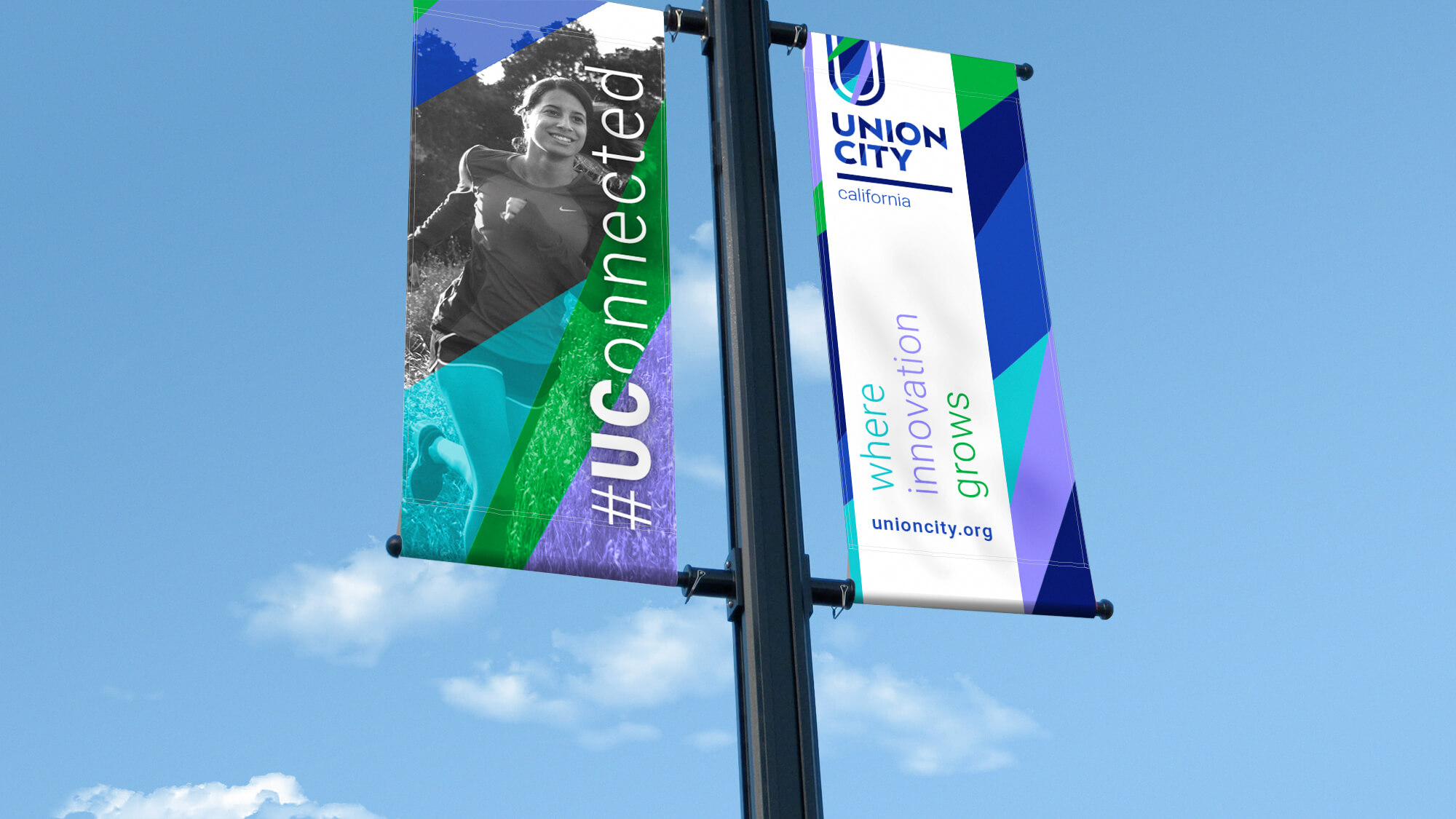
City Logo Design
Union City is located on the eastern side of Northern California’s San Francisco Bay. Home to more than 70,000 people, Union City was seeking to attract new businesses and residents alike. To do that, they needed to improve public perception.
They wanted a new logo that celebrated their diversity, proximity to Silicon Valley, and potential for growth. The project would be 100% paid for through taxpayer payer funds so it was critical that the City use a process that would engage the entire community and ensure success for the project and elected officials.
We worked with the City Manager’s office to gather feedback from city personnel, leaders of the business community, leaders of the faith community, and residents. Using our Zooka 3Ps methodology we worked with them to understand the shared vision and values that made Union City a great place to live and work.
By clearly defining the brand’s core elements, in plain language that everyone can understand, we built a shared understanding of what the brand should be.
The pillars, personality, and promise of the Zooka 3Ps were used both to guide the designers and as a useful way to measure various logo concepts. The 3Ps process made it much easier to involve large groups of people – many of whom were not skilled in business or marketing.
The project was a resounding success serving to further unify residents, businesses, city officials, and the faith community.